How to Choose a Paint Color You Won't Regret in Six Months
The testing process that catches a bad paint color before it's covering your entire living room.

What's inside 11 sections
Quick answer: Test actual sample swatches — at least 2x2 feet — on multiple walls of the room, and look at them across a full day of changing light before committing to a full gallon. The color on a tiny paint chip in the store almost never matches what you'll actually see on your wall once real light and your room's other elements are factored in.
Paint feels like a low-stakes decision because it's "just paint," but a wrong color covering an entire room is a genuinely annoying thing to live with for months before you get around to fixing it. The good news is that a wrong color is almost always preventable with a slightly more disciplined testing process than most people bother with.
Skip the Tiny Chip, Get Real Samples

The little paint chip strips at the hardware store are genuinely useless for making a real decision — they're too small, and the surrounding display lighting is nothing like your actual room's light. Buy real sample pots and paint at least a 2-foot by 2-foot section directly on your actual wall, not on a separate poster board, since the wall's existing color and texture affect how the new one reads too. For the fuller version of this specific question, see common lighting mistakes.
Test on Multiple Walls, Not Just One
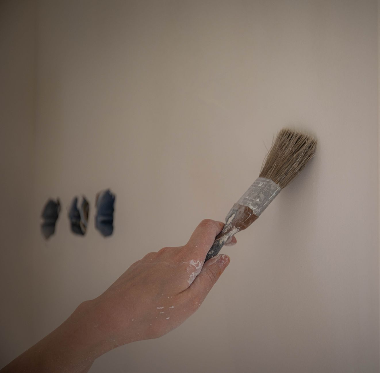
Light hits each wall of a room differently depending on window placement and direction, so a color that looks great on your north-facing wall might read noticeably different on the south-facing one. Paint your samples in at least two or three different spots around the room, and actually compare them against each other rather than judging just one patch in isolation. The current figures are maintained by the FTC's consumer protection resources, worth bookmarking if you want to check for updates.
Watch Your Samples Across a Full Day

This is the step people skip most often, and it's the one that actually matters most. Look at your samples in the morning, midday, and again in the evening under your normal artificial lighting. A color that looks crisp and fresh in bright morning sun can look flat or even a little dingy by lamp light at night — and if that's the light you'll mostly be living with in that room, that's the version of the color that actually matters most to your decision.
| Testing Step | Why It Matters |
|---|---|
| Real sample pots, not tiny chips | Chips are too small and wrongly lit to judge accurately |
| Multiple walls tested | Light direction changes how the same color reads |
| Full-day observation | Morning, midday, and evening light all shift the color |
| Considered against existing furniture/flooring | Colors interact — nothing exists in visual isolation |
Consider What's Already in the Room

A paint color doesn't exist in isolation — it sits next to your flooring, your furniture, and whatever other fixed elements are already in the space. Hold your sample swatches up near your existing floor and any large furniture pieces staying in the room, since undertones that look fine on a blank wall can clash or look off once they're actually next to your specific flooring or furniture's own undertones.
Finish matters as much as the color itself. A glossier sheen reflects more light and reads lighter and more vibrant than the identical color in a matte finish, which absorbs more light and looks a touch deeper and more muted. Test your actual sample in the finish you're planning to use throughout the room, not a different one just because that's what the sample pot happened to come in.
None of this takes more than a day or two of patience before you commit to buying full gallons, and it's genuinely the cheapest insurance in the whole renovation process against a mistake you'll otherwise be looking at every day for the next several years.
Understanding Undertones Before You Commit
Nearly every paint color, including whites and grays that seem neutral at first glance, carries an undertone — a hint of blue, green, yellow, or pink beneath the main color — that becomes more apparent once it's on a full wall rather than a small swatch. A "greige" that reads warm and cozy in one lighting condition can suddenly look distinctly pink or green under different light, which is exactly why the multi-wall, full-day testing process matters so much more for these subtly complex colors than it does for a bold, saturated color where the undertone is much less noticeable either way.
Coordinating Across Adjoining Rooms
If your home has an open layout or rooms that flow visually into each other, think about how your chosen color transitions to whatever's painted in the adjacent space, since two colors that each look great in isolation can clash or create an awkward line where they meet. Testing samples near the actual doorway or opening between rooms, not just deep within each individual room, catches this kind of transition problem before you've painted both spaces and discovered the issue only once it's already finished. This connects with open-concept vs. defined rooms, worth reading if you're weighing that angle too.
When to Just Trust a Professional's Eye
If you've tested several samples and still can't settle on a confident choice, it's a completely reasonable point to bring in a color consultant or ask your painter, if you're hiring one, for their professional opinion. Many paint stores also offer free or low-cost color consultation services specifically because this decision genuinely stumps a lot of people, and a trained eye can often see undertone issues and lighting interactions that are hard to spot without that specific experience. We go deeper on finding a contractor you won't regret hiring in a separate guide, worth a look if it's relevant here.
Paint Quality Affects the Color Too, Not Just Durability
Beyond the color itself, the quality tier of paint you choose affects how true the final color reads on the wall, how evenly it covers, and how well it resists fading and staining over time. A budget paint in the exact right color can still look patchy or require significantly more coats than a higher-quality paint in the same shade, which sometimes erases any upfront savings once you account for the extra time, labor, and additional cans needed to get even coverage. See the EPA's volatile organic compounds and indoor air quality for the source data behind this.
Sample Boards Are a Useful Alternative to Painting Directly on Walls
If you're not ready to commit to painting directly on your existing wall color, or you're testing a color for a room you haven't moved into yet, painting large poster-board samples and moving them around the room throughout the day accomplishes much of the same full-day, multi-location testing without the extra step of eventually repainting over a sample section. This is a particularly useful approach for a room you're planning from a distance, like a nursery being prepared before a specific move-in date.
Trends Fade Faster Than a Well-Chosen Neutral
A trendy, highly specific color that feels exciting right now often ages less gracefully than a well-chosen, timeless neutral with the right undertone for your space. This doesn't mean avoid bold color entirely — a bold choice on an accent wall or in a room you're willing to repaint sooner is a reasonable way to enjoy a trend without the commitment of applying it everywhere. Save your most timeless choices for the larger, harder-to-repaint spaces, and use trendier colors more selectively where a future change of heart is less costly to fix.
Photograph Your Samples for a Record You Can Revisit
Take photos of your test samples at different times of day, and keep them somewhere easy to find later. This creates a useful reference if you want to touch up the paint years later and need to remember the exact product and color, and it's also genuinely helpful if you're trying to coordinate a new room's color scheme against a color you chose previously elsewhere in the house.